One of the first things we'd done upon landing in Barcelona was to determine what would and would not be open on New Years Day. Most things it turns out were closed, but not the Sagrada Familia so having booked tickets online we wandered down eager to discover our own opinions on this unique construction.
 My Uncle, who'd visited it a year or two earlier still raves about it and cannot praise Gaudi highly enough, a sentiment that seemed to be shared by a number of my extended family and friends on Facebook. I already know I'm not a great fan of modern architecture and so while I tried to keep an open mind, I had a suspicion I wouldn't be praising it to the skies. I can take some forms of Modernisme but I think this one was just a little too modern for me.


Our timed entry was an earlier one for though the entry is timed the exit is not and we didn't want to be surrounded by too many other tourists. For the purpose of understanding it properly the first thing we visited was the little display on Gaudi's work and how much of his inspiration was based in nature, conceptualised from the smallest shapes and patterns. It was beneficial as I was able to see the (sometimes tenuous) link back to nature. There is definitely an emphasis on nature here though. Where the entrances to most cathedrals are decorated with saints and angels, Gaudi has instead focussed on nature, populating the Nativity Facade with the complete range of farmyard animals that would have been found in the general vicinity of the Bethlehem stables, plus a few others.
There are elements of the Sagrada Familia which I don't mind and others of which I am not particularly a fan, I can see a glimmer of their beauty in the eyes of others and can appreciate the inspiration and ideas that went into them, particularly as they draw on the beauty of nature instead of the agony and ecstasy of religious fanatics who were then beatified.
 My Uncle, who'd visited it a year or two earlier still raves about it and cannot praise Gaudi highly enough, a sentiment that seemed to be shared by a number of my extended family and friends on Facebook. I already know I'm not a great fan of modern architecture and so while I tried to keep an open mind, I had a suspicion I wouldn't be praising it to the skies. I can take some forms of Modernisme but I think this one was just a little too modern for me.
My interaction with this building started on the evening of our arrival when I flicked my uncle a picture indicating we were staying just down the road from this 'unfinished monstrosity'. (No response).
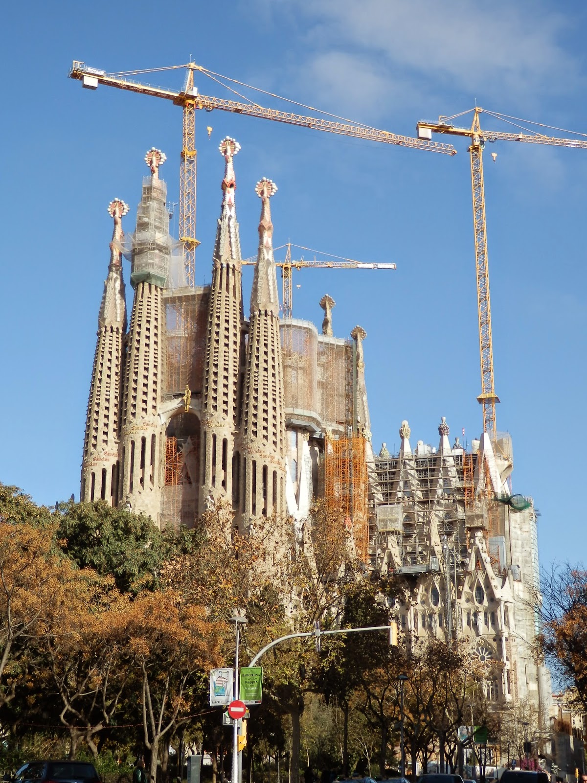
Seeing it, overshadowed still by cranes, I wondered whether Gaudi always liked his creation or if after time he got bored of it? ...got frustrated by it? ...simply lost interest in it as the plans and his visions for it became more and more finalised. Did he ever reach the point where he was no longer happy with it and wanted to move on, to a different project?


Our timed entry was an earlier one for though the entry is timed the exit is not and we didn't want to be surrounded by too many other tourists. For the purpose of understanding it properly the first thing we visited was the little display on Gaudi's work and how much of his inspiration was based in nature, conceptualised from the smallest shapes and patterns. It was beneficial as I was able to see the (sometimes tenuous) link back to nature. There is definitely an emphasis on nature here though. Where the entrances to most cathedrals are decorated with saints and angels, Gaudi has instead focussed on nature, populating the Nativity Facade with the complete range of farmyard animals that would have been found in the general vicinity of the Bethlehem stables, plus a few others.
There still are the typical scenes of the Annunciation and the worship of the shepherds and wise men.
After the oppressively large amounts of religious iconography in many of the other churches I've visited throughout Europe (seeing more of the damn things in art galleries doesn't help), the Sagrada Familia's almost complete lack was rather refreshing. There are no monstrous gargoyles, no ugly demons bashing at the doors of the church. Instead the door is covered in 'leaves' which hide a plethora of insects.
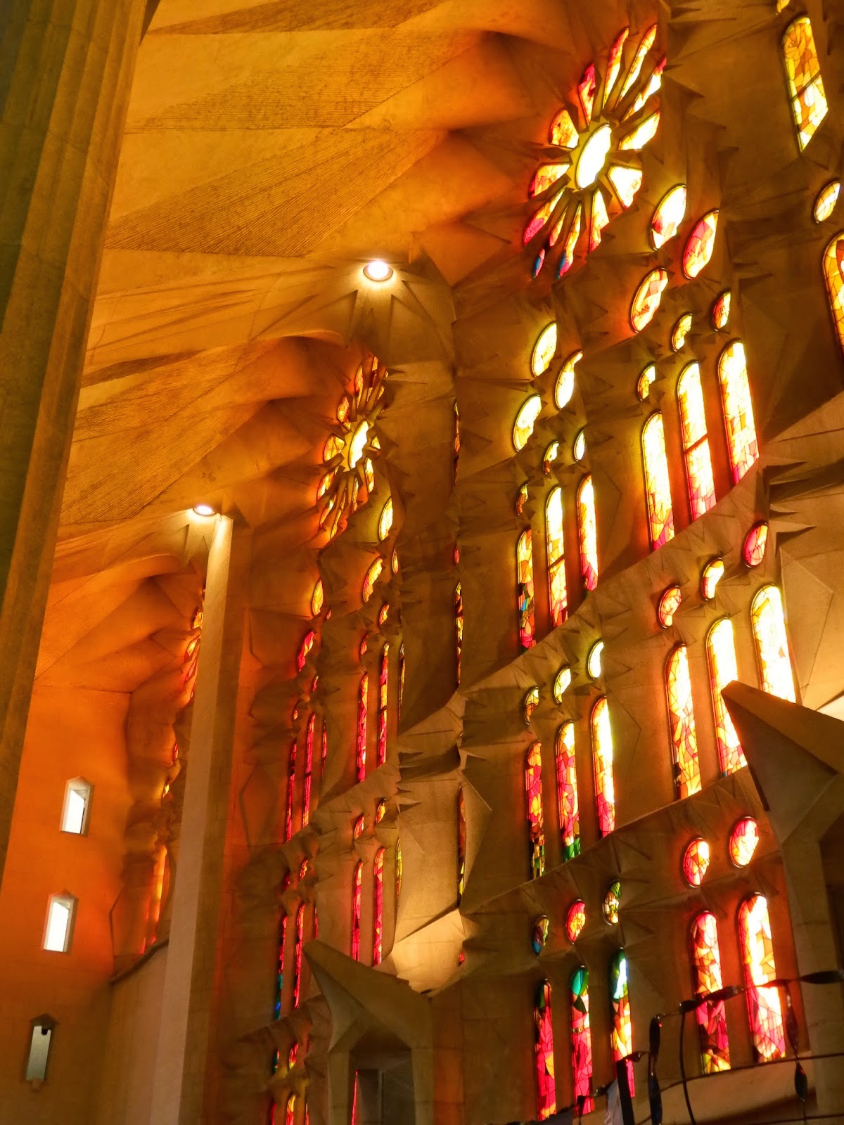
This lack of iconography continues (at this point in time) inside with the building being just the soaring structure with all the spaces in the exterior wall filled with fragmented colours graduating from blue through green and yellow to red. Within each of the rounds of glass was a name or place, leading Mum and I to wonder a connection between the two. With the sun streaming in, this made for a rather magnificent sight.
For me though, there was something disjointed about the experience; there was something too alien, too sinuous about the shapes of many of the supporting pieces of Gaudi's design. The lines are smoother, more natural than those of earlier periods, but at the same time they seem to be lacking the elegance and grace of the Art Nouveau. The lines of nature are present but it is as though they've been shortened and condensed to their bare minimum as opposed to extending the sweeping lines and having them connect multiple pieces or elements together as is more typical of Art Nouveau pieces. The delicacy and finesse I see in even the sturdiest thing in nature has been lost.
The Sagrada Familia is an interesting building. I suppose the fact that 100 years later it is still being built is in keeping with other great cathedrals of Europe, admittedly built several hundred years earlier, or at least completed before the advent of the Industrial revolution. Work on the Cologne Cathedral remained unfinished for ages, there too the landscape being dominated by a crane instead of the finished spires of the church. However I suppose the distinction here is that we have come to expect the Industrial revolution to have resulted in an advent of technology that allows for a far more rapid completion of projects, to the extent that a major building would be finished in a couple of years, a decade at most as opposed to taking more than a century to be completed.
It is interesting to delve into though. This is a building that, like older churches, is primarily about sculpture; sculpture of the dozens of figures on the facade in addition to the unusual graduating shape of the internal columns. This means that until very recently it would have been hard to benefit from the technological advances of the Industrial Revolution and much of the work would still have had to be carried out by hand, skills that would have become rarer and rarer, the more time that passed.
What was definitely worth seeing though was the exhibition in the crypt. this was on the design and construction of the monstrosity overheard and showed with models the transition from a typical cathedral through ever more dramatic and refined designs to the one that is being built now. Now days when I walk into a church I am more interested in the architecture than in the paintings and iconography hanging around. This exhibition showed architectural sketches, designs and one of the tricks used to perfect the weight load on the columns. Additionally it reminded me of two architects I know who would have got lost in the place.
 |
| Pre-Gaudi plans |
 |
| Gaudi plans - Stage One |
 |
| Gaudi plans - Stage Two (being built) |
There are elements of the Sagrada Familia which I don't mind and others of which I am not particularly a fan, I can see a glimmer of their beauty in the eyes of others and can appreciate the inspiration and ideas that went into them, particularly as they draw on the beauty of nature instead of the agony and ecstasy of religious fanatics who were then beatified.
However the Passion Facade of the church is a different matter entirely. It's style is too out of keeping with the rest of the building. Lines are minimalist and sharp, and though Gaudi's were minimalist they were not sharp. Supposedly these are supposed to represent the bones of a skeleton, but this sounds too much like finding justification for a jarring vision. Also there are way too few figures and details, particularly when compared with the Nativity Facade. While yes, it does add to the harrowing nature of the subject, it also produces the impressions of laziness on the part of the designer/sculptor and in-completion.
I just hope that the entire of the Passion Facade is decorated in mosaics or something, to bring it more in keeping with Gaudi's other designs. For at the moment, visually, it stands alone, removed from the rest of the building.
I'd like to visit the Sagrada Familia one more time, when it is finally complete, to see what I think of it then. Until then...


No comments:
Post a Comment